Craig Wright is an experienced technical writer based in Chesterfield, UK. He hates writing about himself in the third person, so I shall stop now.
Always interested in new content writing opportunities. Remote working preferred.

This is Part 3 of a series of posts on how to create the following layout, complete with accordion menu and slide-in drill-down menu, in MadCap Flare.

If you missed the previous parts, see:
In Part 3, we're mostly going to be looking at how to create the master page for this layout, but before we get into that, it is important to know how the Foundation grid works.
WARNING! This is a long post, so expect boredom to kick in at some point!
Before I start explaining the Foundation grid, let me just say that, at the moment, I use Flare 11. I believe there is a responsive layout feature in Flare 12 that uses a similar approach to Foundation (it may even be Foundation), but I'm not sure how that works. I don't expect there to be any conflict between what we are doing with Foundation and how the responsive layout in Flare 12 works, but if there is, please post in the comments.Now, on to the Foundation grid...The Foundation grid is really easy to use, but it can be a little confusing at first, especially if you are used to laying out divs without any sort of grid in place. I normally lay out divs in percentages of the viewport's width, with floats for positioning. Thinking that way really muddied the waters for me when I was trying to understand the Foundation grid. So before we get going, forget about floats etc., for now.By the way, if you are an ISTC member, Matthew Ellison has written an article on the Foundation grid in the Summer 2016 issue of Communicator. (Please note that is the UK organisation, ISTC, not the US-based STC). Matthew has also posted the article on the UA Europe site, here: http://www.uaeurope.com/articles/ResponsiveLayoutMadCapFlare.html.The Foundation grid divides the screen into 12 columns by default (you can't see the columns, but they are there in the background).

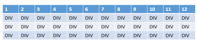
You create your layout by adding rows, and then adding one or more divs to each row. Think of the divs as cells. In the image below, a div has been added to every column in 3 rows.
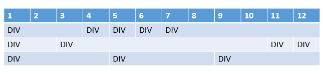
A div can fill the entire width of the row (12 columns) or only part of the width (1-11 columns), and you tell it how many columns to cover in the code. It is a lot like creating a table in Word, really, only you are stuck with 12 columns - you add as many rows as you want and within each row, as many cells as you want. In the image below, you can see:The top row has 5 divs. From left-to-right, div 1 is 3 columns wide (cols 1-3), div 2 is 1 column wide (col 4), div 3 is 1 column wide (col 5), div 4 is 1 column wide (col 6), and div 5 is 6 columns wide (cols 7-12).The middle row has 4 divs. From left-to-right, div 1 is 2 columns wide (cols 1-2 inclusive), div 2 is 8 columns wide (cols 3-10 inclusive), div 3 is 1 column wide (col 11), and div 4 is 1 column wide (col 12).The bottom row has 3 divs. From left-to-right, div 1 is 4 columns wide (cols 1-4 inclusive), div 2 is 4 columns wide (cols 5-8 inclusive), and div 3 is 4 columns wide (cols 9-12 inclusive).
The key thing is that the grid is always 12 columns, it is how we divide those columns up into divs that changes. You can create any combination you like, but it cannot exceed 12 columns. If the divs in a row are less than or greater than 12 columns in total, the layout will mess up, so stick to 12 and stay on the grid.Before we look at how this is actually coded, we need to look at the three different sizes: small (smartphones), medium (tablets) and large (desktops). These are the three sizes we can specify when defining our rows. For example, if you want a row to be 6 columns wide on a desktop but only 3 wide on a tablet, you set the large size to 6 and the tablet size to 3 when you define the size in the code.I know what you're thinking - "well how do I define the frickin' code?". We'll look at that as we delve into Dave's master page.
Back to our Flare project. We're going to look at how Dave has created the layout to work in the Foundation grid, and for that I'll break it down into chunks. (As long as Dave agrees, I will post his template project up when I have documented the script part, which will be the next post in the series).The top part of the master page is the usual stuff you find in any master page - declaring the xml version, the location of the schema, etc.
<?xml version="1.0" encoding="utf-8"?><html xmlns:MadCap="http://www.madcapsoftware.com/Schemas/MadCap.xsd" MadCap:lastBlockDepth="12" MadCap:lastHeight="658" MadCap:lastWidth="829">
The next part is the head, and in here we have three links to files.
<head><link href="../foundation/css/foundation.css" rel="stylesheet" type="text/css" /><link href="../foundation-icons/foundation-icons.css" rel="stylesheet" type="text/css" /><link href="../Stylesheets/TopicStyles.css" rel="stylesheet" type="text/css" /></head>
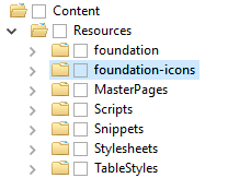
The top one is a link to the foundation.css stylesheet that is one of the Foundation files you downloaded in part 1. The second one is a link to the foundation-icons.css stylesheet, which is optional. Dave included the Foundation icons in this project and uses them in the footer. If you want to use them too, you can download them from here: http://zurb.com/playground/foundation-icon-fonts-3. Just add them to the Resources folder in Flare, like you did with the Foundation framework files.
The final link is a link to the TopicStyles.css stylesheet, which is the stylesheet being used for the Flare project. It is important that you don't edit the TopicStyles.css stylesheet in the Flare editor. This is because of a bug in the editor. As Dave Lee told me: "If you edit anything in that stylesheet using Flare's editor, it will substitute the full stop in 'not(.' with 'not(\00002E'. It's a bug in Flare, it will break a few things which are valid CSS. For the same reason, never edit an external stylesheet (like Foundation) in Flare."Now we get to the actual layout. The first part we are going to create is the menu bar that will only appear on small screens, such as smartphones, and the slide-in menu. To create the slide-in menu, we use the 'drill-down menu' and to create the slide-in functionality, we use the 'off-canvas wrapper'. These are both available in the Foundation files (that we added to the Flare project in Part 1). You can find information on both of these at the Foundation site:
We start with the body element, and then add a div with the class "off-canvas-wrapper". This div is the container for the entire off-canvas area. The off-canvas-wrapper feature works by splitting the display area for the content into three containers:
Let's get started.


In the footer section of the master page, you referenced a footer snippet file rather than adding all the code for the footer. That's just how Dave created the layout, and you could add the code to the master page instead if you wanted. If you want to follow suit and use a footer snippet, here's what you need to do.
Example:I'll show you how to create the footer Dave made, which looks like this:

The code for this is:
<?xml version="1.0" encoding="utf-8"?><html xmlns:MadCap="http://www.madcapsoftware.com/Schemas/MadCap.xsd" MadCap:lastBlockDepth="6" MadCap:lastHeight="401" MadCap:lastWidth="945"><body><div class="row" id="footer-area"><div class="small-12 medium-4 large-6 columns"><h4>Footer text</h4><p>Some content in the footer. This section is a bit larger than the others.</p><p style="font-size: 3rem;"><i class="fi-social-linkedin"></i> <i class="fi-social-google-plus"></i> <i class="fi-social-facebook"></i></p></div><div class="small-6 medium-4 large-3 columns"><h4>Footer links 1</h4><ul><li>Footer links.</li><li>Footer links.</li><li>Footer links.</li><li>Footer links.</li></ul></div><div class="small-6 medium-4 large-3 columns"><h4>Footer links 2</h4><ul><li>Footer links.</li><li>Footer links.</li><li>Footer links.</li><li>Footer links.</li></ul></div></div></body></html>
You can probably work this out for yourself by now, but let's skim through it, just in case.We start the snippet file with the '?xml version' and 'html xmlns:MadCap' parts that you get in all Flare files:
<?xml version="1.0" encoding="utf-8"?><html xmlns:MadCap="http://www.madcapsoftware.com/Schemas/MadCap.xsd" MadCap:lastBlockDepth="6" MadCap:lastHeight="401" MadCap:lastWidth="945">
The next line creates a row named footer-area:
<div class="row" id="footer-area">
The next line creates a div in the footer-area row, and the div is 12 columns wide on small screens, 4 columns wide on medium screens, and 6 columns wide on large screens.
<div class="small-12 medium-4 large-6 columns">
The next few rows add a heading 4 of 'Footer text' to the div, along with some paragraph text and some icons.
<h4>Footer text</h4><p>Some content in the footer. This section is a bit larger than the others.</p><p style="font-size: 3rem;"><i class="fi-social-linkedin"></i> <i class="fi-social-google-plus"></i> <i class="fi-social-facebook"></i></p></div>
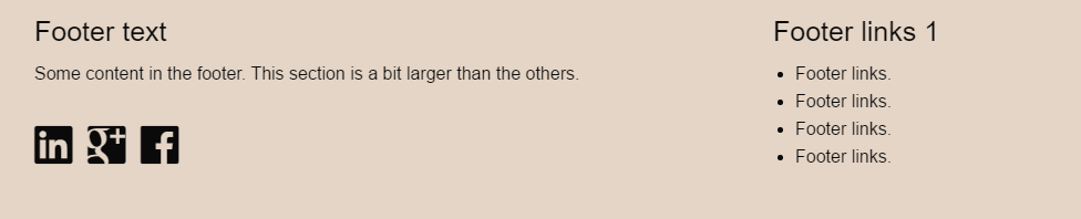
The icons are added by using i class and classes that are included in the foundation-icons.css. If you didn't download foundation-icons, you won't have access to these icons, but you can add images and reference those using regular img elements instead if you wish. The /div closes the div that contains the Footer text heading and the icons. The row div is still open.The code we've looked at so far creates this bit:

The following lines create the second div container, the Footer links 1 heading, and the bullet list:
<div class="small-6 medium-4 large-3 columns"><h4>Footer links 1</h4><ul><li>Footer links.</li><li>Footer links.</li><li>Footer links.</li><li>Footer links.</li></ul></div>
This second div is 6 columns wide on small screens, 4 columns wide on medium screens, and 3 columns wide on large screens. The /div closes this new div, but the row div is still open.The code so far has created:
The third div and second bullet list is created by using:
<div class="small-6 medium-4 large-3 columns"><h4>Footer links 2</h4><ul><li>Footer links.</li><li>Footer links.</li><li>Footer links.</li><li>Footer links.</li></ul></div>
This works in the same way as the previous bullet list section, only it appears to the right of the previous bullet list.The following code closes the row, the body, and the html:
</div></body></html>
I don't know about you, but I'm sick of the sound of my own voice, so let's call it a day on this post. In the next one, I'll go through the script that converts the menu proxy into the format needed by the Foundation menus. That's the last key ingredient you will need. After that, it will just be a case of looking at the stylesheet and making adjustments, looking at how the Foundation stylesheets have been created, and also a quick look at some of the limitations of this layout.Bye for now!Part 4 is now live: Accordion Menu in MadCap Flare - Part 4.

Craig Wright is an experienced technical writer based in Chesterfield, UK. He hates writing about himself in the third person, so I shall stop now.
Always interested in new content writing opportunities. Remote working preferred.
_new_hue.svg.png)


Registered Number: 08029184
Straygoat logo design by Bristol graphic designer, Nik Jones.
© Straygoat Writing Services Ltd.