Craig Wright is an experienced technical writer based in Chesterfield, UK. He hates writing about himself in the third person, so I shall stop now.
Always interested in new content writing opportunities. Remote working preferred.

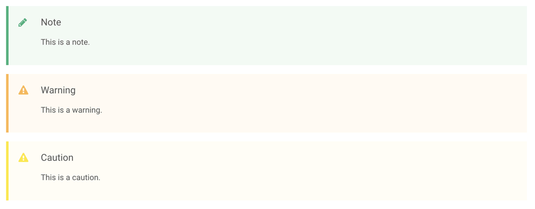
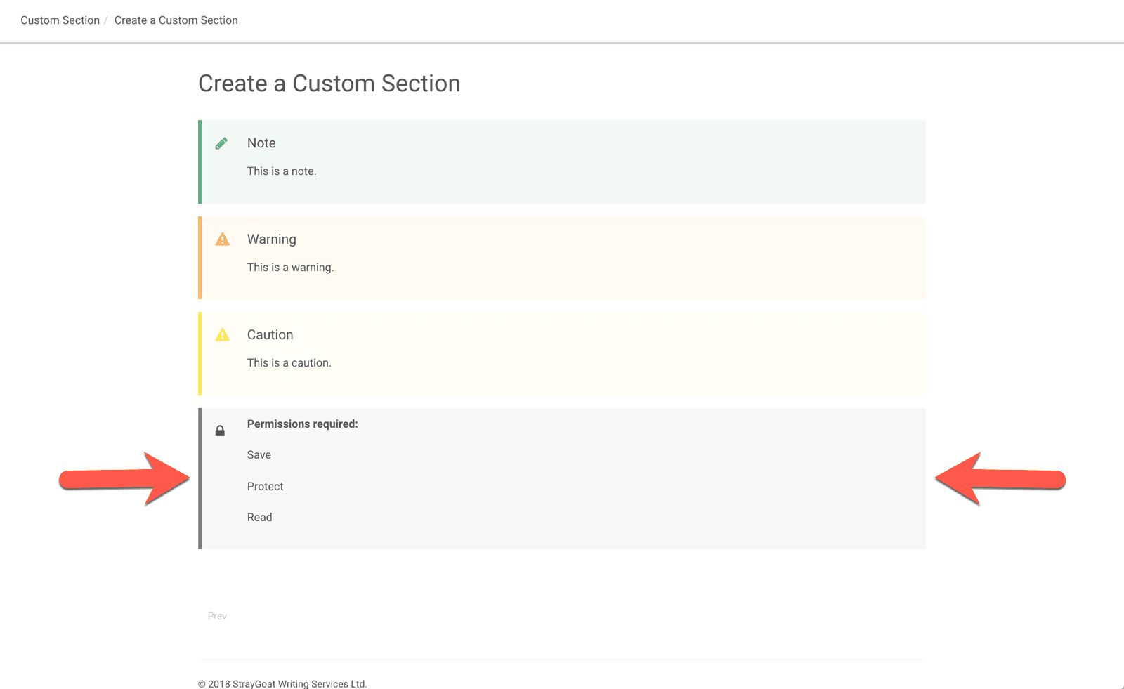
Paligo has a built-in feature for adding attractive notes, cautions, and warnings to your content. Each note, caution, and warning has some css styling applied by default. You can see the styles for the help centre layout below, which use a pastel background and a font awesome icon.
You can also create your own sections and set them to have a similar appearance. Note that I am using the term section to mean a piece of text like a note here, rather than the <section> element.
NOTE: The following method of creating an informal topic template is not the recommended way of doing this in structured text. To do it properly, you need to get a customisation implemented by Paligo, so that there is a new admonition with appropriate elements for your custom content. Also, my work-around will only work on HTML5 outputs. PDF would need a customisation.
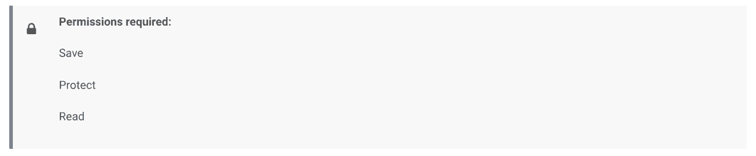
On one of my Paligo projects, I created a section for permissions and gave it a grey background, sidebar, and padlock symbol. The idea was that before each task, the permissions section would be shown. This way, users can quickly identify whether their user account has the permissions needed to access the features described.
There are several steps you need to follow to create your own custom section:
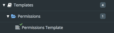
As you're going to use the new section in lots of different topics, you should create it as a template.
To style the content of your informal topic, you need to be able to give it a class. You can then assign styles to the class in a CSS file. To give the informal topic a class, you need to set the Sidebar element's Role attribute.
[et_pb_video src="https://straygoat.co.uk/wp-content/uploads/2018/06/new-section-role-attribute.mp4" border_radii="on|10px|10px|10px|10px" box_shadow_style="preset1"][/et_pb_video]
So far, you have created an informal topic template. When you want to use the informal topic in a regular topic, you first need to create a new informal topic based on the template. You can then add content to the new informal topic as needed, and embed it into a regular topic as a component.
[et_pb_video src="https://straygoat.co.uk/wp-content/uploads/2018/06/add-new-informal-topic-to-topic.mp4" border_radii="on|10px|10px|10px|10px" box_shadow_style="preset1"][/et_pb_video]
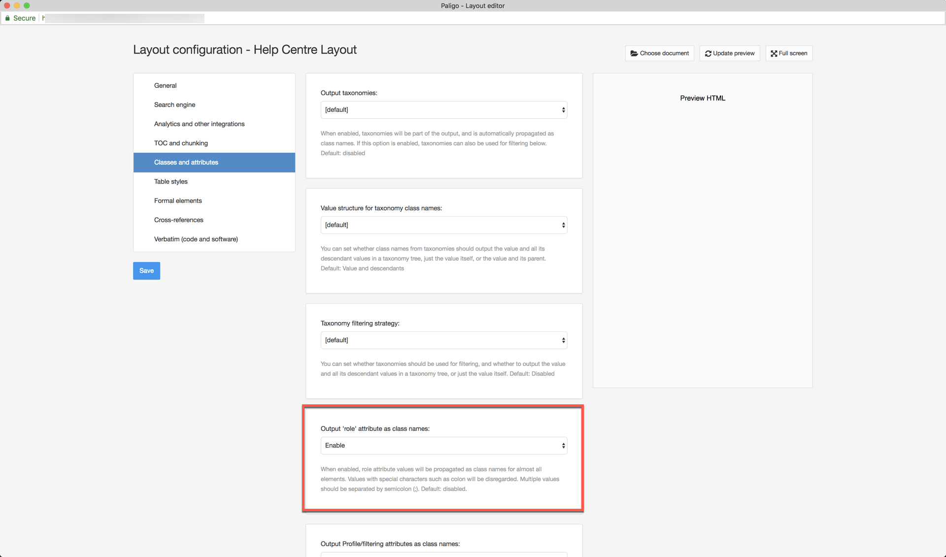
Paligo doesn't convert role attributes to class names by default. You have to enable this feature in the layout.
Next, you need to define how you want the new informal topic to look. You don't do this in Paligo, you do it by creating a CSS file that you will then associate with your publication's layout. You can use pretty much any CSS editor.
I find it easier to create a publication in Paligo first, so that you have an output with the default settings for the informal topic in place. You can then open it in Chrome and use the Inspect feature to view and edit the CSS and experiment with different styling. (Other browsers are available).
The styles you need to add to your CSS for the new informal topic are:
[et_pb_code]/* settings for permissions box */ /* settings for icon */.sidebar.permission-box:before{ content: 'f023'; font-size: 20px; font-weight: 300; position: absolute; left: 20px; top: 22px; vertical-align: middle; font-family: FontAwesome;}/* settings for section box */.sidebar.permission-box{ display: block; padding: 12px 18px 12px 65px; -moz-background-clip: padding; border-left-width: 5px; border-left-style: solid; border-left-color: #708090; line-height: 1.4em; margin-top: 18px; margin-bottom: 18px; position: relative; background-color: #e5e7ea; background-color: rgba(150, 150, 150, 0.08); margin-left: 0px !important; margin-right: 0px !important; }[/et_pb_code]
You will need to replace permissions-box with the name you gave to the Role attribute for your informal topic template. For example, if you gave it the role name spartacus, you would have CSS for .spartacus > p instead of .permissions-box > p and so on. In the code example above, I styled the box to be grey with a slate grey left border and a slate grey icon. The icon code is f040 and this comes from the Font Awesome set. I was only able to get some of the icons to work, which may be because the help centre HTML5 output is still in beta at the time of writing. Or it may be a limitation of only using a free Font Awesome licence. If you know why some icons don't work, please let me know!
The last step is to add your CSS file to the layout for your publication.

Finally, add your topic to a publication and publish it using the layout that is linked to your CSS file. In the output HTML5, the CSS styles you have defined are applied to the informal topic. The role attribute of the section is converted into a class name in the HTML5 output (proceeded by sidebar, for example, class="sidebar permission-box". In the CSS file, your sidebar.permission-box class styles define how the custom section is presented.
By following the steps I've mentioned, you should be able to create your own section with icon. If you run into problems, check that:
Note that every time you want to use your new section, you will need to create a new informal topic based on the template. You can then edit the informal topic and insert it into a topic as a component. You do not select the new section from the menu or the Custom settings on the create content dialog.

Craig Wright is an experienced technical writer based in Chesterfield, UK. He hates writing about himself in the third person, so I shall stop now.
Always interested in new content writing opportunities. Remote working preferred.
_new_hue.svg.png)


Registered Number: 08029184
Straygoat logo design by Bristol graphic designer, Nik Jones.
© Straygoat Writing Services Ltd.